This is the fifth part in a seven-part series about the JavaScript framework, Angular 5.
In this part, we’ll go over building Dynamic Themes for our application.
This is not intended to be a complete guide, but rather an overview of the basics to get you up and running so you can get to know Dynamic Themes and how to use it with Angular Material 5.
Article Series:
- Creating Angular 5 application with Angular-cli
- Using
Angular MaterialwithAngular 5- Deploy Angular 5 Application to Netlify
- Build
PWAwith Angular 5 App- Build Dynamic themes for
Angular Material(You are here)- Using
FlexLayoutwith Angular 5- Building
NewsApp usingAngular 5
Final Demo here
This article is based on the four previous articles so you have to read them first.
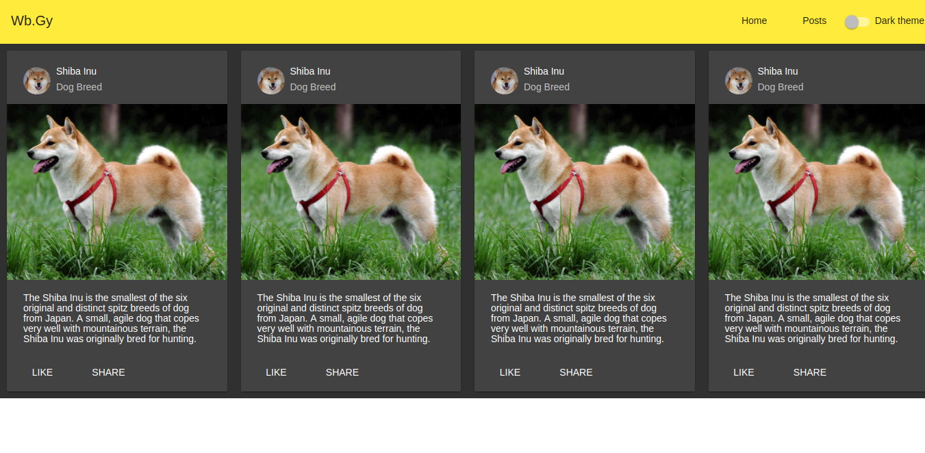
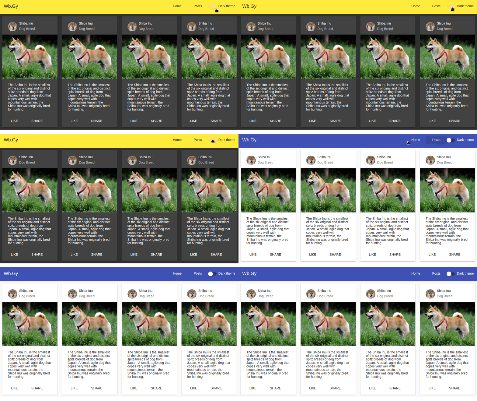
We’ll turn our application to have dynamic themes, actually 2 themes ( light and dark one). Besides changing the theme dynamically, without having to refresh the page.
In the first article I used the argument --style scss to select SCSS as our default styling extension.
Now, create a file src/assets/styles/material-theme.scss with the following code:
@import "~@angular/material/theming";

@include mat-core();

$primary: mat-palette($mat-indigo);
$accent: mat-palette($mat-pink, A200, A100, A400);
$warn: mat-palette($mat-red);
$theme: mat-light-theme($primary, $accent, $warn);

@include angular-material-theme($theme);
Now, we have to import this material-theme.scss in styles.scss
If you were following me and did what I did in the previous articles your styles.scss file should have import for Angular material theme. But now we’ll replace it with our new material theme
It should look like:
@import "./src/styles/material-theme";
body {
  margin: 0;
}
Next, I want to put the controller of the dynamic theme in the navbar, so I’ll create a component for our navbar. and a service to control the theme.
Navbar Component
In your application root run:
ng g component navbar --module app.module.ts
and don’t forget the argument --module app.module.ts I mentioned why in the previous articles.
We need to do several things
- Move the navbar code from
app.component.htmltosrc/app/navbar/navbar.component.html - Move the css styling of the
navbarfromapp.component.scsstosrc/app/navbar/navbar.component.scss. - Put the tag
<app-navbar></app-navbar>inapp.component.html - Add a
material slide toggleto our navbar component
Here’s the code of each file
src/app/navbar/navbar.component.html
<mat-toolbar color="primary">
  <mat-toolbar-row>
    <span>Wb.Gy</span> <span class="example-spacer"></span>
    <a class="example-link" routerLink="/" mat-button>Home</a>
    <a class="example-link" routerLink="/posts" mat-button>Posts</a>
    <mat-slide-toggle>Dark theme</mat-slide-toggle>
  </mat-toolbar-row>
</mat-toolbar>
src/app/navbar/navbar.component.scss
.example-link {
  padding: 0 14px;
}
.example-spacer {
  flex: 1 1 auto;
}
app.component.html
<app-navbar></app-navbar> <router-outlet></router-outlet>
and app.component.scss should be empty now.
Next we need to add our dark theme to material-theme.scss
Now it should look like:
@import "~@angular/material/theming";

@include mat-core();

$primary: mat-palette($mat-indigo);
$accent: mat-palette($mat-pink, A200, A100, A400);
$warn: mat-palette($mat-red);
$theme: mat-light-theme($primary, $accent, $warn);

@include angular-material-theme($theme);

// Our dark theme
.dark-theme {
  color: $light-primary-text;
  $dark-primary: mat-palette($mat-yellow);
  $dark-accent: mat-palette($mat-amber, A400, A100, A700);
  $dark-warn: mat-palette($mat-red);
  $dark-theme: mat-dark-theme($dark-primary, $dark-accent, $dark-warn);

  @include angular-material-theme($dark-theme);
}
Let’s check if our theme works or not
Open app.component.html, we’ll add two divs and put all the code into them:
<div class="dark-theme">
  <div class="mat-app-background">
    <app-navbar></app-navbar>
    <router-outlet></router-outlet>
  </div>
</div>
Check your page now you should see the dark theme works!

Now let’s create the theme service
ng g service services/theme --module app.module.ts
this will create new folder under src/app and new service named theme
To make our theme service publish changes to our components we have to use rxjs.
Let’s edit our service:
src/app/services/theme.service.ts
import { Injectable } from '@angular/core';
import { Subject } from 'rxjs/Subject';

@Injectable()
export class ThemeService {
  private _themeDark: Subject<boolean> = new Subject<boolean>();
  isThemeDark = this._themeDark.asObservable();

  setDarkTheme(isThemeDark: boolean) {
    this._themeDark.next(isThemeDark);
  }
}
Now let’s import our theme service to our navbar
src/app/navbar/navbar.component.ts
import { Component, OnInit } from '@angular/core';
import { ThemeService } from '../services/theme.service';
import { Observable } from 'rxjs/Observable';

@Component({
  selector: 'app-navbar',
  templateUrl: './navbar.component.html',
  styleUrls: ['./navbar.component.scss']
})
export class NavbarComponent implements OnInit {

  isThemeDark: Observable<boolean>;

  constructor(private themeService: ThemeService) { }

  ngOnInit() {
    this.isThemeDark = this.themeService.isThemeDark;
  }

  toggleDarkTheme(checked: boolean) {
    this.themeService.setDarkTheme(checked);
  }
}
and In navbar.component.html
<mat-toolbar color="primary">
  <mat-toolbar-row>
    <span>Wb.Gy</span> <span class="example-spacer"></span>
    <a class="example-link" routerLink="/" mat-button>Home</a>
    <a class="example-link" routerLink="/posts" mat-button>Posts</a>
    <mat-slide-toggle
      [checked]="isThemeDark | async"
      (change)="toggleDarkTheme($event.checked)"
      >Dark theme</mat-slide-toggle
    >
  </mat-toolbar-row>
</mat-toolbar>
The last thing is to add our theme service to our app.component.ts
import { Component, OnInit } from "@angular/core";
import { Observable } from "rxjs/Observable";

import { ThemeService } from "./services/theme.service";

@Component({
  selector: "app-root",
  templateUrl: "./app.component.html",
  styleUrls: ["./app.component.scss"]
})
export class AppComponent implements OnInit {
  isThemeDark: Observable<boolean>;

  constructor(private themeService: ThemeService) {}

  ngOnInit() {
    this.isThemeDark = this.themeService.isThemeDark;
  }
}
One last thing in our app.component.html
<div [ngClass]="{'dark-theme': isThemeDark | async}">
  <div class="mat-app-background">
    <app-navbar></app-navbar>
    <router-outlet></router-outlet>
  </div>
</div>

Next: Using FlexLayout with Angular 5
Some useful Links:
- 👨️ My Website/Portfolio
- 🔥 Get your $50 in FREE hosting credit HERE
- 🤑️ No Stripe? How To Get Paid With Payoneer ⇒ $25 + $10 Sign UP Bonus